As part of the Shopify 2.0 launch, Shopify launched their new base theme called: “Dawn”.
Dawn is the new reference default theme for Shopify, replacing its predecessor: “Debut”.
Dawn was created as a faster, lightweight and easy to edit theme for Shopify website owners.
Whilst Dawn and Debut share similarities in terms of their functionalities, one of the big questions we get asked from our clients is around changing image sizes for product images.
In this article, we will show you how you can quickly change the size of your main product images in the Shopify Dawn theme.
The Dawn theme launched in June 2021 alongside “Online Store 2.0“.
It was designed to offer significantly more customisation options for website owners and provides a much more lightweight design.
Some of the main features of the Dawn theme include:
Whilst the new features are great, we are asked a lot by our clients on how they can change their product page image sizes.
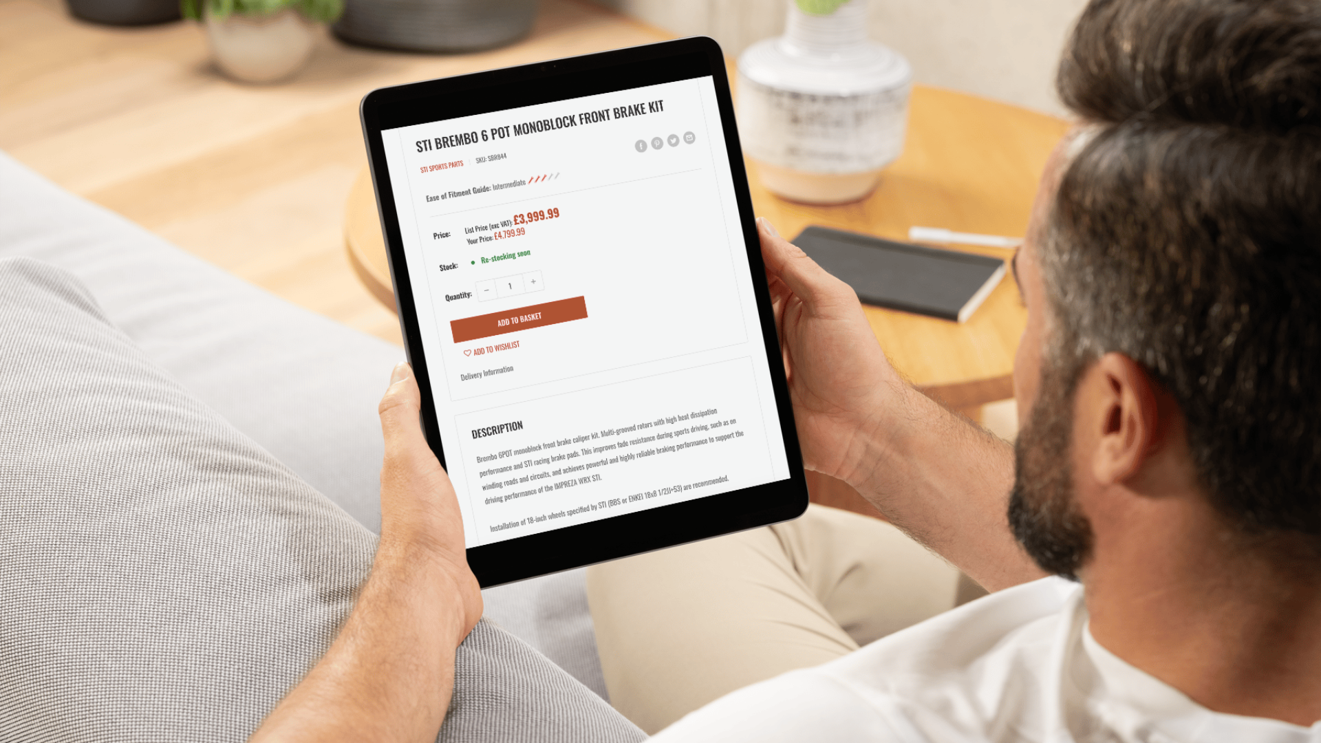
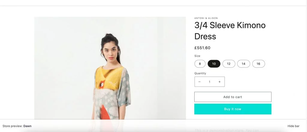
The image appears quite large on the product page which isn’t ideal for some businesses where image detail isn’t as important. The page layout is roughly set to a 60/40 split, 60% of the layout used for the product image and 40% for the product information.
There isn’t an option to allow you to change the ratio of your product page, simply within the Shopify admin. Fortunately, with a little bit of coding, you can edit the column widths to suit your store.
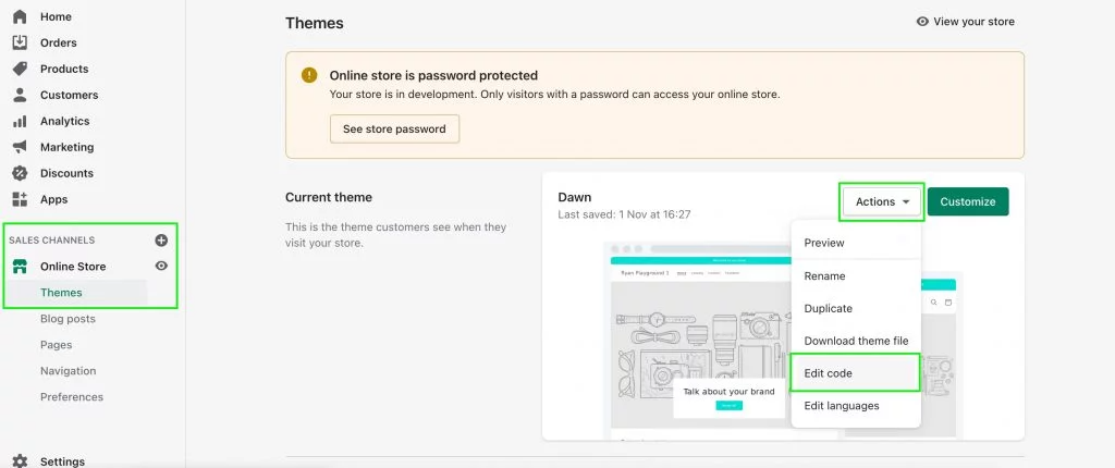
In your Shopify admin go to your “Online Store” > “Themes” > “Actions” > “Edit Code” which will take you to your theme customisation screen where you can access the theme code.
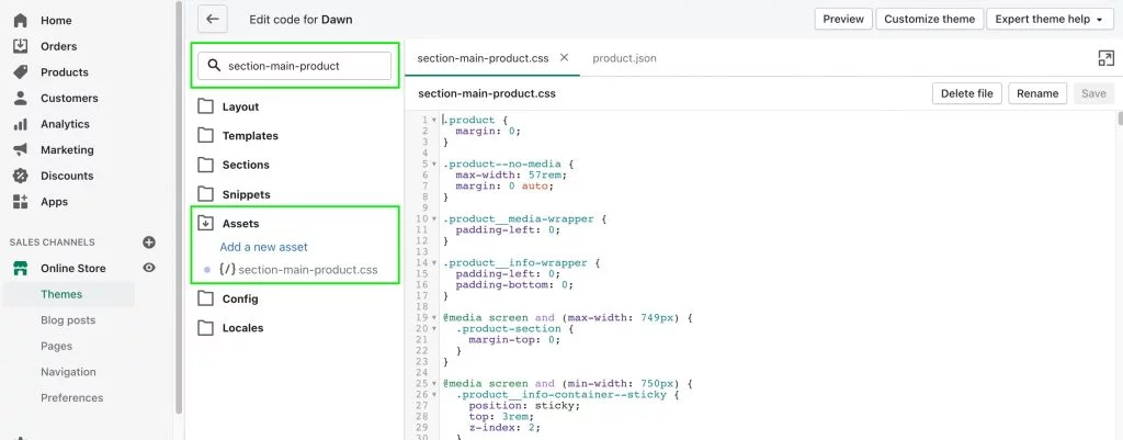
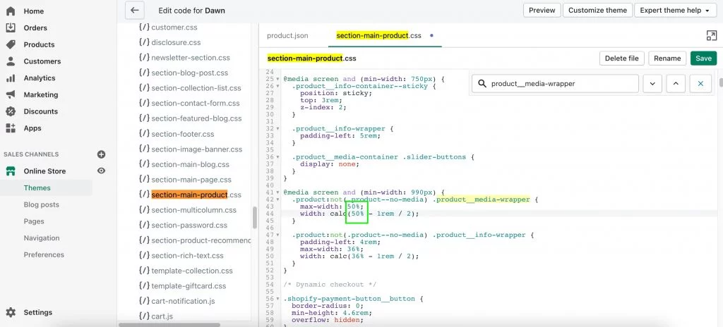
Search “section-main-product” in the file search bar and then click on the “Assets” folder to open the file.
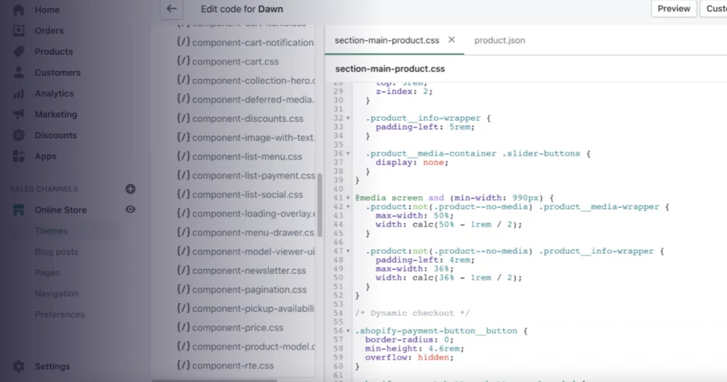
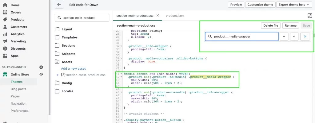
Once you have the file open, go to line 41 to find the “@media screen” section. If it’s not here, select “CTRL+F” or “CMD+F” on macOS and search for “product__media-wrapper” to find the settings for the product image width.
You then want to reduce the percentages in this section in order to reduce your product image size to allow more room for the product information. In the below example we have reduced it from 64% to 50% to split the image and content evenly.
Before
@media screen and (min-width: 990px) {
.product:not(.product–no-media) .product__media-wrapper {
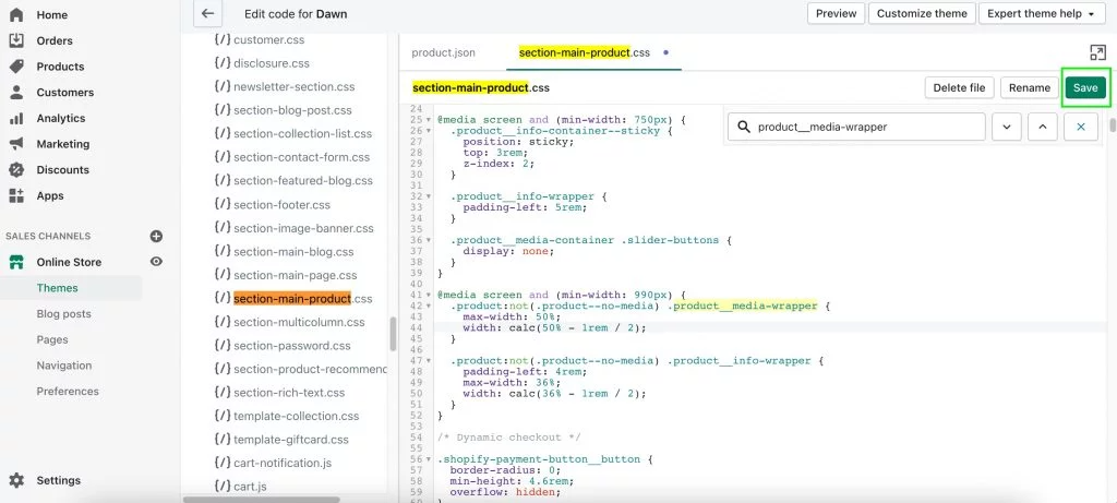
max-width: 64%;
width: calc(64% – 1rem / 2);
After
@media screen and (min-width: 990px) {
.product:not(.product–no-media) .product__media-wrapper {
max-width: 50%;
width: calc(50% – 1rem / 2);
Select “Save” to keep your layout changes so they appear on the front end.
Go to your product page and select refresh to see your layout changes pull through.
Before the changes
After the changes
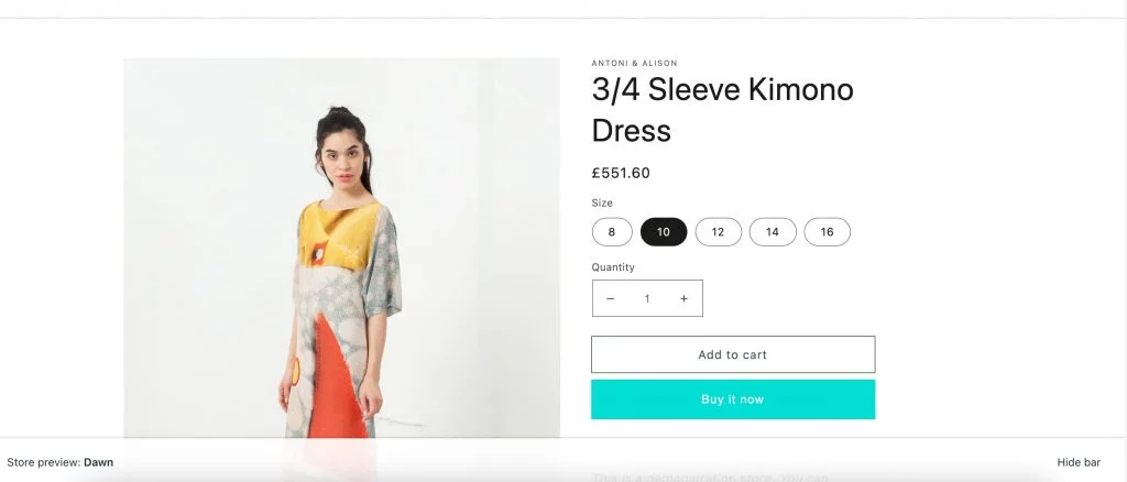
You can set your width to whichever percentage you wish to have your images. And that’s it! We would always recommend you check mobile and tablet too and not just laptop and desktop viewports to ensure all your changes work as intended.
If you are looking for assistance in finding out more about Shopify as a platform, then please get in touch with our expert developers at our Shopify development agency.


