Mobile and desktop users have settled at an even 50% split, meaning responsive images and content are vital for an eCommerce website. However, the user experience goes beyond this, with fast pages, intuitive layouts and standardised experiences all needed to capture maximum engagement and sales.
Using Magento offers plenty of flexibility through the use of CMS blocks that can be used throughout the different pages on your website. Within these blocks, you have full control of all components such as text and images.
The temptation when building these pages and blocks is to forget about the mobile version. Most of the time you will naturally preview the work on a desktop viewport. If anything, the complete opposite should be prioritised. Not thinking mobile can lead to a slow to load and confusing layout is going to frustrate users and ultimately, damage your sales.
Using srcset for Magento, Shopify or other eCommerce platforms with true responsive design, the performance of your website will improve and ultimately provide an improved user experience for mobile visitors.
We've gone through the process plenty of times and know that a little more work upfront will provide a better long term ROI. Setting the standard for all pages and for all images from day one is best practice.
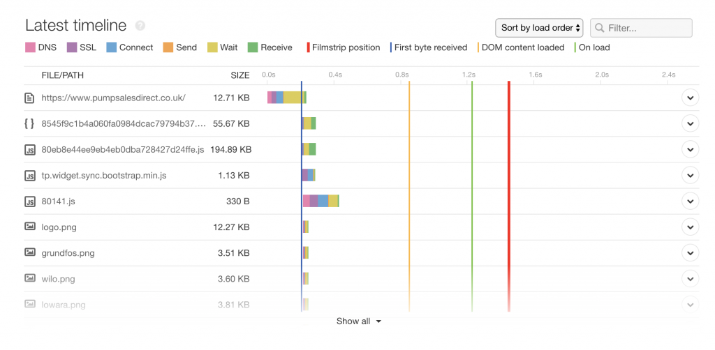
Images are generally going to be one of the bigger files on your website. The more these can be compressed the better. Ideally, larger images shouldn't be over 150kb and smaller images over 100kb. Of course, it depends on the context of the page and the purpose of the images.
The opportunity to optimise the size of these images even further is only a resize away. This is why you should end up having two different images: one for desktop and one for mobile. The appropriate image will be loaded based on what device the user is using.
The biggest difference is that a scaling image is using the larger desktop image to work on mobile, while a responsive image will have two separate yet optimised images.
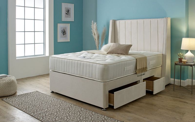
Remember that the viewport for Desktops is generally landscape, compared to mobiles that are portrait. This will cause issues if you simple shrink the desktop image down to mobile width, as this examples demonstrates.
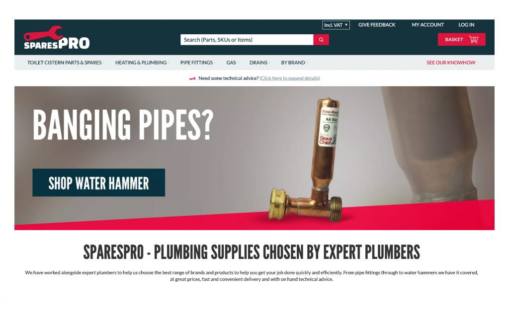
Original desktop banner:
Scale vs Responsive image banner:
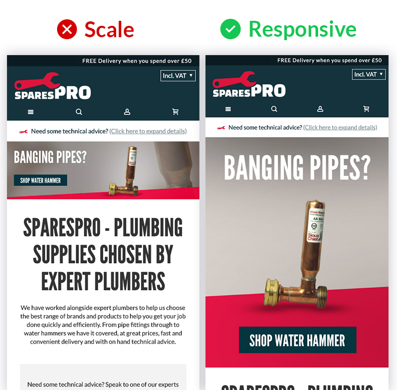
You can also notice that the 'Scale' version of the image has a very small call to action and is almost illegible. Compare that with the larger easy to press call to action on the responsive version and more engaging visual appeal.
The desktop banner automatically switches over to the mobile banner once the viewport is hit by scaling the browser down. This viewport can be changed, but in this example it changes at 650px.
In order to make any image responsive you need 2 images (one for desktop and one for mobile) and upload them to your Magento media folder.
In your CMS block, you can add this code that has the srcset and replace the image URLs to the ones you have uploaded:
<picture>
<source media="(max-width: 650px)" srcset=“/media/wysiwyg/image.jpg“>
<img src="/media/wysiwyg/image.jpg">
</picture>
Using the responsive image method is one of many areas that need to be carefully considered to make your website fully mobile-friendly. There are different tools that will help compress and speed up the loading of your images (and consequently your page) so shaving off as many kilobits as possible will all add up.
If you need assistance with your Magento page designs or CMS blocks you can get in touch to see how we could assist your Magento website design.
Iterative eCommerce Growth
Magento integrations
International eCommerce


