
We’ve been receiving a lot of questions about Mobile-First Indexing recently - not least because of a message appearing in the Google search console stating that mobile-first indexing is enabled for some sites. Website owners are right to be curious but, in most cases, it is no cause for anxiety.
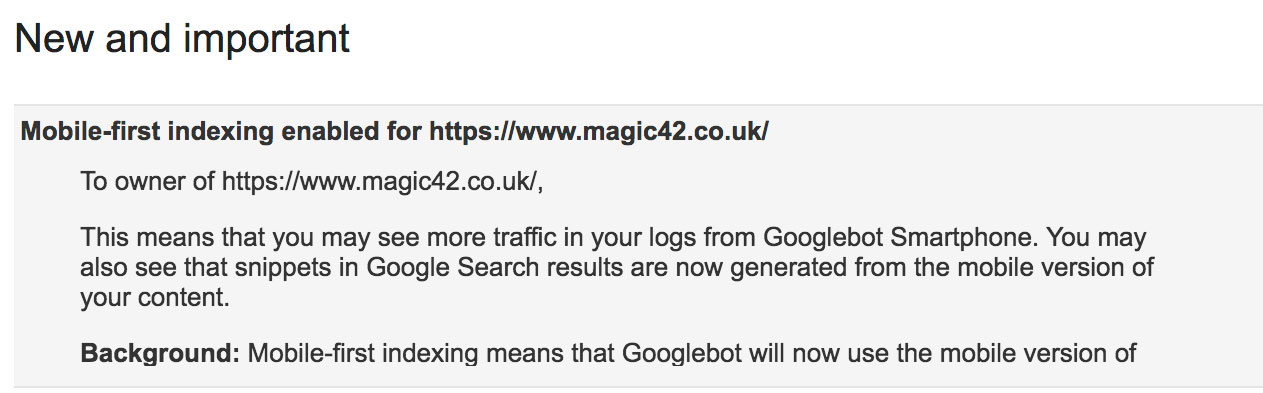
Simply put, Google will soon be prioritising the indexing of the mobile version of all websites over the desktop versions. In practical terms, this means that when Google is determining what site content to show in its search results, it will attempt to get that content from the mobile version -not the desktop version - of your site. This change is being rolled out slowly and some sites have already had mobile-first indexing enabled. You can see when mobile-first indexing has been enabled for your site by checking your messages in the Google Search Console. If it has, you will see a message like this:
If you think about it, indexing mobile sites before desktop ones makes perfect sense given the behavioural shift that has seen traffic volume from mobile overtake non-mobile in recent years. The important question site owners need to ask themselves is “What should we be doing to prepare for the change?”
Don’t panic. If your site is responsive, the impact will be negligible. The equity you have built with search engines over the years is unlikely to be affected - at least in the short term. Responsive sites serve the same content to both desktop and mobile users adjusted for screen size. Therefore, the content being indexed is the same for both mobile and desktop meaning your search ranking is unlikely to be affected greatly. Your site will likely be responsive if it is built using Magento or WordPress. You can check whether your site is mobile-friendly using Google’s Mobile Friendly Test page. Something that may make a difference to all site owners, however, is being on HTTP/2 supported hosting as this will increase you site speed - a known ranking factor for Google. Now may well be a good moment to check your hosting.
It seems there is a lot of confusion out there surrounding this point. Let’s take a look at some examples of what I’m referring to:

It is convention for responsive design to compress the main navigation into a drop down menu to provide a less cluttered page. The site navigation, particularly for online retailers, is usually keyword rich and indicates the main categories for which shoppers may be searching. Any suggestion that the practice of compressing the site navigation into a drop down menu on smaller viewports (i.e. mobile) will harm your ranking is entirely false. Firstly, the full navigation will still be indexed by Google’s mobile-first bots as it is still there - despite only revealing itself on click. And secondly, Google’s algorithm is ever-more focussed on site usability, which such responsive elements actually enhance meaning that sites that employ this kind of responsiveness will, if anything, benefit from the change to mobile-first.

Similarly, sites that hide content using “read more” or “continue reading“ on mobile with the intention of enhancing the look and feel of the site will certainly not be penalised for doing so but rather stand to be rewarded for providing a better user experience.
The single biggest change you should make is behavioural. It’s still all too common to hear content creators asking each other “How does it look on mobile?” In 2018, you should be seriously thinking of banning this question in your office. Why? Because it treats mobile as an afterthought; something to check once you are satisfied with the desktop version. You should be designing for mobile, thinking about mobile, testing with your phone, testing with your colleagues' phones, replicating all sorts of viewports on your browser. And when you’re satisfied, it’s safe to ask “How does that look on desktop?”


